
The Buzz’s color scheme is focused around yellow, with purple being a strong accent to it. This hero’s color scheme is based on that of a bumblebee, with purple being a main color instead of the usual black. Because The Buzz fights for the good of his city, I chose positive, bright colors that associate him with flowers and bright natural colors. This association with flowers also connects to the design of his costume being bee-like. Another strong element of The Buzz’s color comes from the thin stripes, which add to his element of speed when he is flying around.

This photo depicts The Buzz’s life and popularity. Because he is such a renowned figure within the city, he is constantly in the spotlight, wherever he goes. While he does retain a hidden identity, the city is in constant peril, which forces him to be in action during most of his waking hours. As a result of this, he is put on a constant spotlight for everyone to see. His actions are judged daily in the press, and his psyche is put on for the city to see. He is also the lone superhero, which is why there is no other character alluded to in the photo.

While this shape
doesn’t seem to be very descriptive or detailed, it does a good job of
depicting The Buzz’s lean, angled figure.
While much of his design is based on a bumblebee, his shape is much more
similar to that of a wasp. With
very sharp angles, his design closely resembles that of an acute triangle.
Because much of his power comes from his speed, this small profile and
ergonomic shape provide him with the mobility that he uses to defeat
crime. His strong lines and angles
help to create an iconic shape that people associate with him.
Bad Bomber
 The Bad Bomber’s
colors are thick and directly oppose one another. Because the stripes are so thick, they seem to counteract
The Buzz’s thin ones. The Bomber’s
two colors also directly oppose one another, presenting an odd juxtaposition to
the viewer’s eyes. This
juxtaposition helps to establish the essential innate dislike for the hero’s antagonist. The deep saturation also helps to show
that this character is full and passionate. Red and blue are also classical opposite colors, which lead
an onlooker to have an instant distrust in someone wearing such vibrant
versions of each.
The Bad Bomber’s
colors are thick and directly oppose one another. Because the stripes are so thick, they seem to counteract
The Buzz’s thin ones. The Bomber’s
two colors also directly oppose one another, presenting an odd juxtaposition to
the viewer’s eyes. This
juxtaposition helps to establish the essential innate dislike for the hero’s antagonist. The deep saturation also helps to show
that this character is full and passionate. Red and blue are also classical opposite colors, which lead
an onlooker to have an instant distrust in someone wearing such vibrant
versions of each.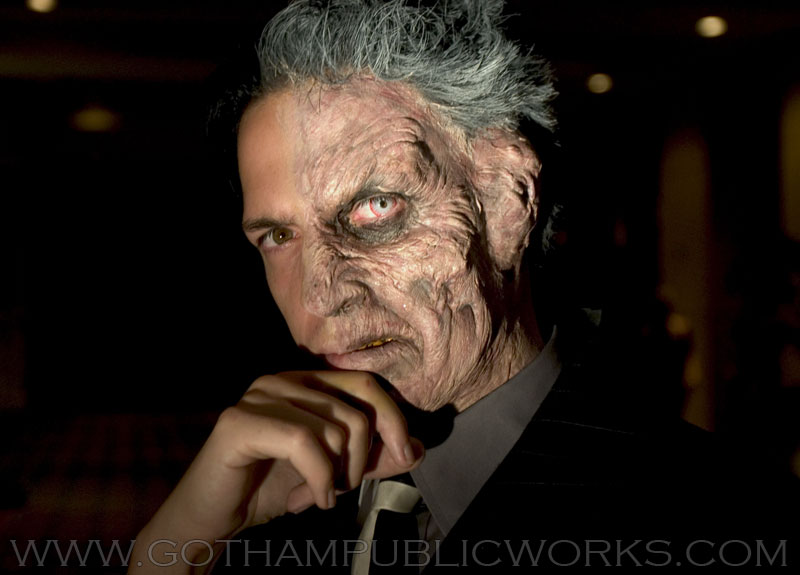
The lighting here
emphasizes the Bad Bomber’s dark, brooding personality. Because he typically
appears at night, he provides The Buzz with very little opportunity to study
his face and body. Commonly lurking in the shadows and avoiding full exposure
to light, the Bomber’s lighting is often very spotty and lead to his
ambiguousness. The lighting
in this photo also helps to emphasize his menacing nature, though. Because the light is so frontal and has
an obvious source, it causes the viewer to feel uncomfortable. The environment surrounding him is dark,
much like the environment that he thrives in.
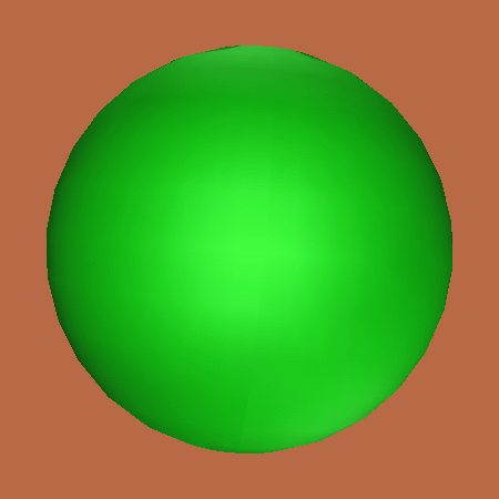
The Bad Bomber’s
shape very much resembles that of a sphere, with little definition or
distinguishable body characteristics.
The bulbous elements of his suit provide him protection and the ability
to carry many gadgets with him. It
is also a direct juxtaposition to The Buzz’s lean, sharp design. Because the
protagonist and antagonist have such stark differences between their designs,
it helps to establish their conflict and rivalry. The round shape also adds to
the difficulty in distinguishing his physical characteristics as there is no
definition shown for his actual body, but rather the suit.
No comments:
Post a Comment